


 Del.icio.us
 JamsBio
 Last.fm
 Musebin
 Pownce
 Rhapsody
 Signal Patterns
 Strands
 StumbleUpon
 Virb
Virb YouTube
Last FM Visualizations
![]() Initially, i really appreciated the way Last.FM would chart my listening behavior. It provided new insights into my music consumption that were unavailable in iTunes. Over time, they became less interesting. The trapped-in-time snapshots fail to provide me with any additional insight into my behavior. So I decided to take a look at some tools that use your Last.fm data to make it more personal and insightful.
Initially, i really appreciated the way Last.FM would chart my listening behavior. It provided new insights into my music consumption that were unavailable in iTunes. Over time, they became less interesting. The trapped-in-time snapshots fail to provide me with any additional insight into my behavior. So I decided to take a look at some tools that use your Last.fm data to make it more personal and insightful.
Lee Byron
There has been a ton of buzz regarding Lee Byron’s beautiful histograms of Last Fm data. His inclusion of the time element has the power to elicit a strong personal connection to your listening history. As you explore the histogram, you can see how preferences change over time an how one could map that data to personal events. Unfortunately, Mr. Byron does not provide a means to generate your own histogram.
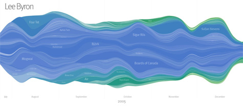
Chart Stream
Inspired by Byron’s work, this is a tool that provides a simple visualization listening habits over time, derived from weekly Last.fm artist charts. Chart Stream does not allow you to view your own data though has a number of nice examples.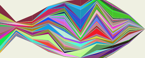
LastGraph
More promising is LastGraph, which looks like it will generate a Byron-esque histogram based on your Last.fm profile. However, when I went to use the tool, there were no rendering nodes currently online. I’ll need to check back after the holiday is over.
Your Last.fm in Time
Another tool for visualizing behavior over time. Unlike the others, it graphs artists based on total cumulative playcounts. Though not as useful or immersive as a histogram, it does provide some interesting insights into behavior.

Chart Changes
This is a very cool Greasemonkey script that inserts chart position changes directly into your Last.Fm charts.

Score500
Displays historical data from the overall charts as charts and diagrams. And it calculates and displays the chart changes over a period of time. You need to request an account to see your own data.
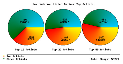
How Do You Listen to Music?
This a a very interesting tool that provides some very insightful behavioral statistics and charts.
Extended Last.fm Stats
Just type in your Last.fm username and a date range and this tool will return tons of interesting artist stats such as playcounts, weeks in charts, and chart positions.
Mainstream-O-Meter
The Mainstream-O-Meter calculates your mainstreamness by comparing the listener count of your favorite bands to the average listener count of the five bands who have the most listeners among Last.fm-users.

Musical Taste Meter
The script lists the users top 20 overall artists and lists the 8 most similar artists to each one, then delete’s any repeated artists. The idea is to see how varied your taste is, a score of 9 is extremely unvaried while 160 represents an extremely varied one.
AEP Calculator
AEP is a measure of how diverse your music tastes are, based on the top 50 artists in your Last.fm profile.
Eclectic Score
A script that computes your eclectic score based on the 20 top artists in your musical profile from Last.fm.
Similarity-O-Meter
Compare two Last.fm users, based on their personal musical tag clouds. This approach is different from the approach used by Last.fm, where users in the population are compared based on the common artists in their playlist.
Personal Tag Cloud
Generates a genre-based tag cloud based on your top artists within a specific time frame. there is also a tool to generate a cloud of recommended artists.
 Jadam Kahn
in Data Mining, Statistics, Tools, Visualization
|
Jadam Kahn
in Data Mining, Statistics, Tools, Visualization
|
 10 Comments
|
10 Comments
|
 1 Reference
 View Printer Friendly Version
 Email Article to Friend
References (1)
-
 Response: Colomarine 98 postall about Colomarine and top news

Reader Comments (10)
very nice overview... I wasn't aware that there are that many analyzers & visualizers out there...
I wonder if there's any service which keeps record of your historical listenings (track-based), the last.fm-feeds don't go back very long...
Very nice overview! Some of those visualizations are very impressive.
@ Michael Kamleitner
Have you tried using the Last.fm API?
Hi, you've compiled a nice list. I thought you also might be interested in my album cloud. It creates a cloud of album art based on your number of listens.
There's another visualization that also works with last.fm (it visualizes connections in the social network).
http://fidgt.com/visualize
LastGraph is now back online, just so you know. That render node downtime lasted slightly longer than I expected, I should have warned people...
LaLaClick - this is another visualization - happy about feedback
Yet another visualizer for last.fm... :)
http://pattie.fe.up.pt/i_know_that_artist/
A simple but cool visualization of artist network:
http://pattie.fe.up.pt/i_know_that_artist/
Have fun!
LFMPlayer - Last.FM Ripper and much more..
A research project at TU Berlin - Contribute to my research on Adaptive User Interfaces by using the Player. Profit from great features like Listening to Last.FM Radio Stations, Ripping (with Auto ID3 Tagging), Play MP3s, Album Synthesis, Lyrics, Slideshow and more..
http://www.indiji.com/lfmplayer.html
I have the pleasure to brief you on our Data Visualization software "Trend Compass".
TC is a new concept in viewing statistics and trends in an animated way by displaying in one chart 5 axis (X, Y, Time, Bubble size & Bubble color) instead of just the traditional X and Y axis. It could be used in analysis, research, presentation etc. In different business sectors, to name a few we have Deutsche Bank Asset Management in NY, Vanguard, Institutional Investor, Perella Weinberg, RIM, Princeton University as our clients
The following link is for our new Geographical Trend Compass:
http://epicsyst.com/test/map/
Link on UK Master Card vs Visa performance :
http://www.epicsyst.com/test/v2/mastercard_vs_visa/
Links on Funds:
http://www.epicsyst.com/test/v2/best_exchange_traded_funds/
http://www.epicsyst.com/test/v2/us_insurance_funds/
http://www.epicsyst.com/test/v2/aaim_fund_performance/
Link on other KPIs :
http://www.epicsyst.com/test/v2/hospital_performance/
http://www.epicsyst.com/test/v2/international_insurance/
Link on Chile's Earthquake (27/02/2010):
http://www.epicsyst.com/test/v2/EarthQuakeinChile/
This a link on weather data :
http://www.epicsyst.com/test/v2/aims/
This is a bank link to compare Deposits, Withdrawals and numbers of Customers for different branches over time ( all in 1 Chart) :
http://www.epicsyst.com/test/v2/bank-trx/
Misc Examples :
http://www.epicsyst.com/test/v2/airline/
http://www.epicsyst.com/test/v2/airline2/
http://www.epicsyst.com/test/v2/stockmarket1/
http://www.epicsyst.com/test/v2/tax/
http://www.epicsyst.com/test/v2/football/
http://www.epicsyst.com/test/v2/swinefludaily/
http://www.epicsyst.com/test/v2/flu/
http://www.epicsyst.com/test/v2/babyboomers/
http://www.epicsyst.com/test/v2/bank-trx/
http://www.epicsyst.com/test/v2/advertising/
This is a project we did with Princeton University on US unemployment :
http://www.epicsyst.com/main3.swf
A 3 minutes video presentation of above by Professor Alan Krueger Bendheim Professor of Economics and Public Affairs at Princeton University and currently Chief Economist at the US Treasury using Trend Compass :
http://epicsyst.com/trendcompass/princeton.aspx?home=1
I hope you could evaluate it and give me your comments. So many ideas are there.
You can download a trial version. It has a feature to export EXE,PPS,HTML and AVI files. The most impressive is the AVI since you can record Audio/Video for the charts you create.
http://epicsyst.com/trendcompass/FreeVersion/TrendCompassv1.2_DotNet.zip
All the best.