The Logos of Music 2.0 - Twitter Style
iPhone Streaming Radio Services Compared
![]() Many of the major players in streaming personalized radio have developed an iPhone application since the release of the iPhone App Store. After waiting a few months to let them work out some kinks and with the release of Slacker’s app this week, i thought it would be a good time to dive in and compare some of these services.
Many of the major players in streaming personalized radio have developed an iPhone application since the release of the iPhone App Store. After waiting a few months to let them work out some kinks and with the release of Slacker’s app this week, i thought it would be a good time to dive in and compare some of these services.
Last.fm is my choice for best of class. Even though it lacks some of the editorial and genre stations provided by other services, it makes up for it with tag radio, recommendations and artist information. However the main reason I use it over the others is that Last.fm is directly tied to my iTunes listening (my main consumption arena) so the recommendations are the most representative of what I’m listening to day to day.
Pandora provides some excellent programming as well and their “Quick Mix” station provides a good stream of recommendations based on other stations I have created. The simple UI and basic feature set make it super easy to use.
Slacker, the newest entry, is a slick and rich experience. The combination of editorial, genre and artist/song seeded stations provides lots of choice. the ability to fine tune each station is an excellent differentiator. The addition of artist bios and album reviews provides great non-audio discovery mechanisms. The ability to see the next song is also a very nice feature.
Deezer doesn’t have much going for it in terms of a broad feature set. The main reason I use it is something I assume is due to it’s French origin – the recommendations are similar to other services but somehow different enough – I seem to discover some interesting bands I don’t think i would encounter with the others.
Finetune’s iphone app is pretty similar to their website and desktop application. In addition to some good editorial stations (e.g. Best of 2008 genre charts) and artist radio, you can also access your own playlists. unfortunately you cant add items you hear on stations to those playlists. There isn’t much else here feature wise but again worth checking out to see if you like their recommendations.
| Feature |  Last.fm Last.fm |
 Pandora Pandora |
 Slacker Slacker |
 Deezer Deezer |
 Finetune Finetune |
| Editiorial Stations | • | • | |||
| Genre Stations | • | • | • | • | |
| Subgenre Stations | • | • | • | ||
| Tag-based Stations | • | • | |||
| Artist-based Stations | • | • | • | • | • |
| Song-based Stations | • | • | |||
| Recommendations Station | • | • | |||
| User-based Stations | • | ||||
| Saved Stations | • | • | • | • | |
| Recent Stations | • | • | |||
| Bookmarks/Loved Songs | • | • | • | ||
| Album Reviews | • | ||||
| Artist Bio | • | • | • | ||
| Related Artists | • | ||||
| Events | • | ||||
| Listeners | • | ||||
| Tags | • | ||||
| Ads | • | ||||
| Skips | Unlim | 5/hr | 6/hr | Unlim | 5/hr |
| See Next Song | • | ||||
| Bookmark Song | • | • | • | ||
| Rate Song | • | • | • | ||
| Share Song | • | • | |||
| Tag Song | • | ||||
| Add to Playlist | • | ||||
| Buy on iTunes | • | • | • | ||
| Finetune Station | • |
Musebin Launches Microreview Service
 Musebin wants to do for the album review what Twitter has done for status message – raising the short paragraph to an addictive art form. Musebin allows you to easily create 140 character or less album reviews and allow other people to vote and comment on your review. What is truly amazing to see is the poignancy, humor and density of thought that a skilled writer can deliver within such a concise format.
Writing a review is simple enough – simply type the name of an artist or album. Musebin will provide you with suggestions that match to help find exactly what you are looking for. If you dont want to write your own review, you can copy an excerpt from an outside source and provide a link back to the original source. This is great for artists who wish to provide reviews of their work without relying on other people to do it for them. Once your review is published, it can be seen by the public. You also have the ability to link your Twitter account and have your review automagically show up in Twitter.
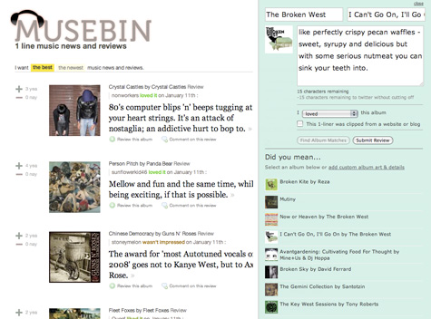
You have the ability to rate any review with a yea or nay and add your own comments. The combination of review plus rating provides a checks and balances system where the community can vote down overhyped albums and inflate albums with unjustified bad reviews. Album pages allow you to listen to the album through an embedded LaLa or 8tracks player. The sidebar also shows a customizable list of tons of music 2.0 services where you can either purchase, listen to or download the album.
Musebin is an engaging and entertaining experience but still lacks some features that will truly make it world class including the ability to follow other users and more robust discovery mechanisms (related artists, albums, etc). They also need simple tools that provide the ability to syndicate your own content on other web sites. It will be interesting to see how Musebin evolves as the industry is moving away from albums to singles, a trend well recognized and executed by a similar service, Blip.fm.
Music Patterns Tries To Define Me and Misses
 Signal Patterns is a company that tries to help you discover the real you by learning more about yourself. They have created a music product called Music Patterns which was just released publicly today. The process of self-discovery begins by listening to a variety of different music samples and rating them from disliking to liking something a lot. The entire process only takes a few minutes.

Once the survey is complete, you are given the results in a dashboard-style presentation. In addition to your results, the service provides actual music recommendations, lets you connect with like minded people, and a playlist tool (based on imeem). Music Patterns is pretty good at determining what you like - in my case it lets me know i like instrumental, intelligent and complex music. However it interprets that as thinking i would like Rush and Yes - two bands I completely despise. I think it miserably fails in determining what i dislike. For instance it tells me that i do not like music with amplified instruments or music played at ear shattering volume - i think my Rock and electronica heavy CD collection and 20+ years of concert going will tell you a different story.
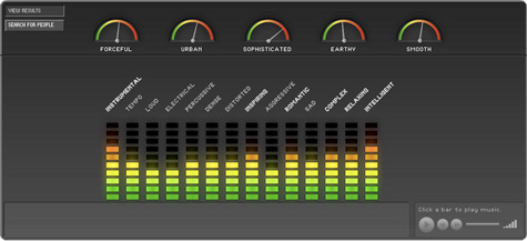
An audio-based survey fails because while it can somewhat determine aspects of music i may gravitate toward or repel from. Its not that i dont like loud music - i didnt like the loud music they were playing. Its not that i don’t like percussive music - i actually love it - but the few examples they played were not representative of the style i like. Many songs i disliked because i had negative associations with the genre not the mood - just because i dont like smooth jazz does not mean i dont like smooth music. Finally and most importantly, this type of survey ignores meaning and interpretation. Its like the Charlton Heston scene in Waynes World - every genre has its true artists and its dime-a-dozen mediocrity - play me a song from a master and i will react differently than i would from hearing a wannabe.
Rocketsurgeon Launches Music 2.0 Product Buzz Feed
 Announcing The Music 2.0 Product Buzz - an aggregated feed of Music 2.0 company blogs. Unlike other aggregated feeds that track industry news, the Product Buzz feed focuses more on what individual companies in the space are doing – announcements, product updates, press releases, etc. It’s a great way to keep track of what the hundreds of companies listed in the Music 2.0 Directory are doing.
There are scores of company blogs aggregated in the feed and I will be adding even more over the next few days and weeks. While building this feed, I revisited every site listed in the Music 2.0 Directory. I was astonished to find out that over half of the Music 2.0 sites out there don’t have a product blog. Come on guys - its almost 2009.
Anyway, I hope you all enjoy the service. I recommend subscribing to the feed as the page on my site still occasionally has issues rendering the feed correctly.
Twones Launches Music Activity Aggregator
 Twones, an Amsterdam-based startup, launched a beta of their new music activity aggregator/social network. The idea behind Twones is a solid one - there are so many music services out there and simply no way to get your friends to use the same one. This makes sharing music and seeing what your friends are listening to pretty difficult. In addition to tracking what you listen to on your media player (iTunes, Winamp, etc), Twones also allows you to track music you listen to on dozens of different music sites including Last.fm, iLike, YouTube, Finetune, MySpace, imeem, MOG, Seeqpod, Deezer, Hype Machine and many more. Your listening activity is then aggregated and presented on your Twones profile page. Friends can see what you are listening to and playback songs on their original source page or other services. When you find songs you like, you can bookmark them for later.
Lifestreaming services like Strands and Friendfeed require you to have accounts with specific services so they can access the RSS feeds of your listening activity. Twones, uses a Firefox plugin that basically tracks whatever you listen to on the web regardless of whether you have an account with a specific web service. This has the advantage of aggregating a much wider range of music activity. On the flipside, there is no way to globally block tracking on specific services aside from manually clicking the icon in the browser window to disable the tracker.
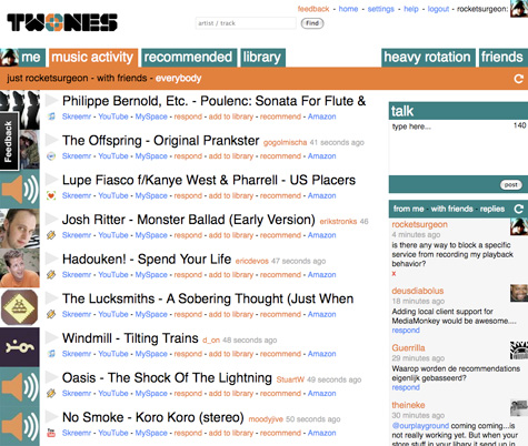
Like other social networks, you can find people to “follow”. When viewing the Music Activity tab, you can see your own activity, your friend’s activity and everyone’s activity. Its a good way to see what other people are listening to and discover new music.
Twones also lets you search for artists and songs. Search results and artist pages take a Foxytunes approach and are loaded with information including bios (Wikipedia), similar artists (Last.fm), concerts (Eventful), albums (Amazon), videos (YouTube), photos (Flickr), and recent chatter (Twitter).

There are some issues with the service. Your dashboard has a recommendations tab but that does not seem to be working yet or provide any explanation of what it is. The charts seems to be inoperable at this time as well. The UI attempts to be clean and concise but for some reason comes across as more clunky and cluttered. More attention to typography and better use of ajax for progressive disclosure of information would be a great help.
The Twones beta version is a promising start and clearly addresses a need with today’s multiple source model of digital music consumption.
JamsBio: Share Your Top 5 Desert Island List
 I’ve been playing around with a new music community site called JamsBio. The site allows you to create and share your own music reviews and top five lists like the ones sprinkled throughout, “High Fidelity”.
Creating your own list is simple and fun. After you name your list, you can search for songs to add. Select your desired track from the results and add an optional comment. When you are done you can publish the list to the JamsBio community and send it to friends. People can hear 30-second samples of the tracks and purchase them on Amazon or iTunes. Once the list is published, other people can add their own list based on the same subject you posted. JamsBio calculates each members individual list to create a master “people’s choice list”.
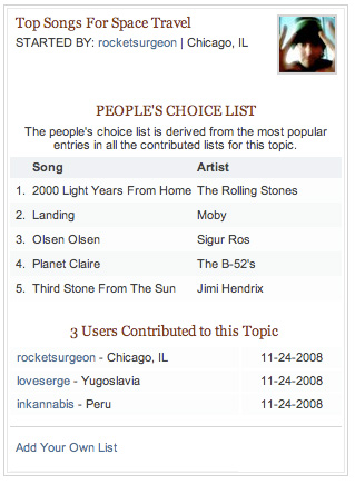
Unfortunately, as of now, there is no way to grab your list and embed it on your blog or website - an unforgivable omission in this day and age. There is also no ability to listen to full-length tracks via a subscription service (such as rhapsody) or export the tracks as a playlist file.
Creating your own reviews is also very simple. Search and find a song you wish to review and write your own review, memory, concert review or dedication. Unfortunately, there is no way to import my reviews into my blog or lifestream (though there is a embeddable widget)

JamsBio’s (a funny sounding name when written as a possessive) listing, reviewing and even games components are all well designed and engaging experiences in and of themselves. Even the captcha in the registration process was pretty cool. However when taken as a whole, these elements don’t gel together yet as a cohesive site experience. Its difficult to find like-minded people, the search feature is a bit disjointed, artist and tag detail pages are difficult to find and many of the internal promotions clutter the otherwise streamlined UI. Many of these issues can be easily worked out over time and i look forward to the day that they are.
Amazon Windowshop: A Killer Browsing Experience
 Amazon recently released Windowshop Beta, an immersive user interface for exploring new releases and editors picks within books, music, movies and more. You use your arrow keys and spacebar to pan and zoom through the 3-D display of information. When you zoom in on an item - say an album, a song sample automatically plays. The same happens for movie trailers, audiobooks and even dead-tree editions. In fact, you don’t even need to use a mouse at all on the entire site except when you want to buy something (a “buy” keyboard command would be very nice). The next item automatically loads after the media sample for the current item ends. This is a nice touch because you can leave the window open, let it play while you do something else and come back when you hear something that sounds interesting.


Right now, the site is a pretty basic browsing experience, and a good one at that. If you want similar experience that actually allows you to search for specific items check out Cooliris.
Say It With a Song: Postcard.fm
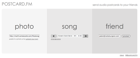
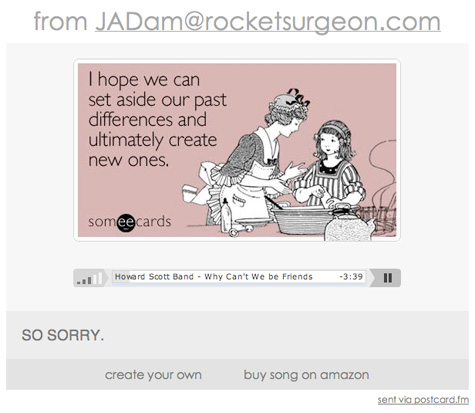
 Why bother sending the standard ecard when you can say it with a song? Postcard.fm is an elegant, idiot-proof service from the same people who created the fantasy label site The Next Big Sound. The service lets you easily combine a photo, a song and a message for an awesome e-greeting. Photos can be directly uploaded from your computer or you can type in an image’s URL. You can also upload your own music file or search for a song using SeeqPod’s library of mp3 songs. Now i can finally mashup those wonderfully snarky greetings from someecards with equally cheeky music.
Music Recommender Mufin Goes Public
 Mufin provides song-based recommendations based on other songs. Unlike services such as Pandora which use human intervention to determine song characteristics, Mufin uses sound-based criteria such as such as rhythm, tempo, instrumentation and sound density to determine whether or not a song is similar to another song. After playing with the service for a while, i wish there was some human touch. Mufin’s recommendations aren’t terrible but they fall prey to the misunderstanding that I would like two songs simply because they sound alike. Measurable audio characteristics are important elements of a song’s construction, but without taking into account style, mood, and intent they are just loosely similar. Its like saying you would like two chairs because they are both black, leather, cushy, and swivel without taking into account the design, period and style.
You begin by typing in an artist or song name. Each result allows you to listen to a sample (when available) and view similar tracks directly inline. More often than not, many of the recommendations are the same song you are checking out or are not available to preview. If i cant hear a recommended song its useless to me and would prefer that you show me nothing at all. You can also add songs to a notepad (useful for remembering stuff you like) or a playlist. Why someone would want to create a playlist of 30 second samples is beyond me, but i suspect Mufin plans on providing some for of streaming playback sometime soon. Mufin also breaks the cardinal rule of multiple play button on a single page - when you click play on a different song, the original song does not stop. Try it out using “Row Row Row Your Boat”

There are some nice features though. Since they way you explore the site is to jump from song to song, Mufin keeps track of your clickstream history so you can easily go back and forth to previously viewed items. They also do some nice things with ajax in the UI to progressively disclose different types of information which makes for a pretty clean and uncluttered design.
The Next Big Sound
 Ever wish you could head your own record label? The Next Big Sound is a new music 2.0 site that lets you play music mogul - scout unsigned talent and sign the artists you think will make it to the big time.
Many sites such as Fairtilizer, use a Digg-style model where users vote for content they really like. The more votes an item gets, the higher the rank. TNBS takes a different approach. Your label can only sign 10 bands at any given time, so you must be very choosy about which ones you think will succeed - ensuring that only the best artists climb to the top.
There are a variety of ways find unsigned talent - search, charts and filtering your player by new artists and genres. There are also many ways to stumble upon random artists. Once you find a great band you can sign them to your label. Based on how many other labels sign your bands after you, you get mogul points - the more points you have, the higher your prestige and ranking in the charts. If you are the first label to sign a band and other people then sign the band, you get a big boost in mogul points.
You can track all of your label’s activity on your dashboard. There is an update area on the page that shows recent activity among your bands, new band announcements (sign them quick!), and moguls you follow. It even lets you know when another label that has a roster similar to yours signs a new band. There are also some cool visualizations that show your point breakdowns and timeline.
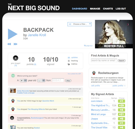
Overall, the site is slick, has an intuitive UI and is a lot of fun to play with. It would be great if there was an RSS feed of my updates so i don’t need to continually monitor the site for new bands and other news. It would also be nice to be able to download mp3s of the artists I sign. If I am helping them out by raising their visibility some free song downloads aren’t too much to ask for.
Rocketsurgeon Returns
Jadam Kahn (aka Rocketsurgeon) Joins MyStrands
 Hello readers. It is my pleasure to announce that I have taken a full time position as Director of User Experience at MyStrands. MyStrands is a leader in developing technologies to help people discover things they like and didn’t know about already. As you may have noticed, over the past few months, MyStrands has been assembling an incredibly talented team of industry professionals and academics in addition to securing a significant round of funding. I am also pleased to again work side-by-side with my former colleague at AOL Music Now, Jason Herskowitz to help architect, design and develop another killer user experience.
What does this mean for you dear readers? Well, I may need to be a bit more judicious regarding certain topics I cover on this blog, but I plan on continuing to provide the extensive and in-depth reviews, commentary, and directory listings regarding the Music 2.0 space you have come to expect.
In the meantime check out my profile page on MyStrands.
SNL iPhone Spoof
Pict.fm - Create Artist Avatars With Last.fm Data
![]() Pict.fm is a utility that allows you to create an animated profile avatar based on your favorite or recently listened to artists charts in Last.fm. You basically type in your last.fm username and select your avatar size. Pict.fm then provides you with a list of artists to select from. If more than one photo exists for an artist, you can select which one you wish to display. When you are done, Pict.fm provides you with the necessary URL and HTML code to embed in your profile.
Pict.fm is a utility that allows you to create an animated profile avatar based on your favorite or recently listened to artists charts in Last.fm. You basically type in your last.fm username and select your avatar size. Pict.fm then provides you with a list of artists to select from. If more than one photo exists for an artist, you can select which one you wish to display. When you are done, Pict.fm provides you with the necessary URL and HTML code to embed in your profile.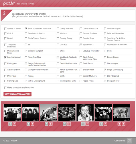
Last.fm Visualization: What's Your Open Mind Index?
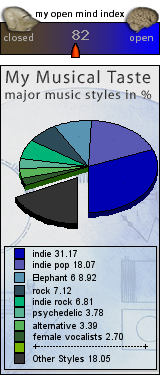
 The LastFM Open Mind Index (OMI) is an interesting way to understand your taste in music. The index is a calculation based on your last.fm top artists of the last 12 months. The quantity of your played songs, as well as the artist-tags are reflected in the calculation. A high OMI is an indicator for a high musical bandwidth and your openness for different kind of music.
After you type in your last.fm username, you are provided with your own musical taste widgets which can be embedded in your last.fm profile. The site also provides consolidated data for about 80,000 last.fm users and reveals some interesting information (e.g. Vatican City has the highest OMI at 106.9). Here is my OMI calculation:
Ask.com Music Search
 With roughly a 4% market share in search, it’s not surprising that Ask.com has been aggressively marketing their service. The new campaign, launched this summer basically shows an invisible user accessing core features of the service and effectively demonstrating how it is different than Google. For obvious reasons, the recent commercial featuring a music search for KT Tunstall caught my eye…
So I decided to check out Ask music search myself. For many artists the first result is biographic information provided by All Music Guide which also includes links to the artist’s discography, songs, and credits. The official band site and MySpace page also usually appear at the top of the results. You can narrow your search using specific predefined queries for content such as lyrics, tabs, chords, tour dates, CDs, videos, ringtones, posters and more. The page also provides links to expand your search which includes related artists and related names (e.g. band members) The right sidebar also also includes some special features such as images, playable popular tracks (from iLike), the Wikipedia entry, and videos from multiple sources.
The results really shine when searching for more popular artists or artists with fairly unique names. It’s not so good in other cases. For instance searching for Dengue Fever didn’t provide me with any band related results but instead provided links about the dreaded disease from which the band got their name. Cases like this leads me to believe search engines should come up with a universally accepted method to narrow searches specifically for music such as typing “Band: Dengue Fever”.
Overall, the Ask music search it pretty good and certainly much better than Google. However I would only use Ask when looking for web pages with artist information or articles. For searching artist related images, videos, songs, discographies and other music-specific targets Foxytunes Planet does a much more reliable and comprehensive job.
Ezmo: Social Music Sharing
 Norway-based Ezmo is a flash-based service that allows you to upload music from your computer so you can access your collection from any web browser. The service also allows you to create playlists and share music with your friends. There are many services out there that provide similar functionality such as Anywhere.fm, iMeem and Streampad and unfortunately Ezmo does little to raise the bar.
Uploading Music Sucks
I have close to 100 gigs of music on my hard drive and there is no way to upload my entire collection in any reasonable amount of time. Additionally while the Ezmo player seems to have scanned all 22,000 of my songs it only attempts to upload around 500 of them. There are other services out there like SimplifyMedia that use better approaches to scan and share media libraries.
Browsing Libraries Suck
Ezmo lets you invite up to 10 friends to share music with and they need to be people you invite. Ezmo is a social network of sorts but a weak one at best - there is no way to search or browse for other people who use the service. Once I do have a friend who accepted my invitation and waited for them to upload music, I can then see their collection. In the meantime, I just need to sit back for a few hours and wait for music to be uploaded so I can begin playing - hmmm, maybe I will add some friends, listen to group radio, and get some recommendations on Last.fm while I wait.
However, there is no context for browsing collections. Ezmo provides no charts or predefined playlists such as top songs, recently played and just added, for you or your friends. Ezmo is missing an opportunity here as there are no charts that aggregate behavior across my friends. Additionally there is no way to search for music across all my friends. Say I want to hear a new song by the Crimea - I have to know that a specific friend of mine has that artist to be able to locate it.
UI issues
The flash interface takes a long time to load and suffers from many issues such as making my scroll wheel useless and stopped playback when the page is in an inactive browser tab. One feature Ezmo almost gets right is the ability to add songs from your friends libraries to your own playlists. However, the playlist UI is overly convoluted and confusing. To add a friends song to a playlist i need to:
1. Click on my library
2. Click my playlist tab
3. Click a playlist name
4. Select edit playlist
5. Click on a friend icon
6. Find a song in their library
7. Drag a song to the playlist pane
Wrong playlist? I need to start all over again.
Conclusion
Lack of any truly compelling social features coupled with serious UI and uploading issues makes Emzo seem very Music 1.0 in a world of great Music 2.0 sites.
Gruvr's New Band Tracker Widget
 Gruvr is a Music 2.0 service that allows you to track bands and see when they are coming to town. The just released a new widget that allows you to post a visual band tour map on your web page, social network profile or blog. The widget is essentially a mashup of a band’s MySpace tour date information and google maps. Users can click on the “Tour Map” link to access a more interactive map and additional information.
Boogie4.us: Music Blog Aggregator
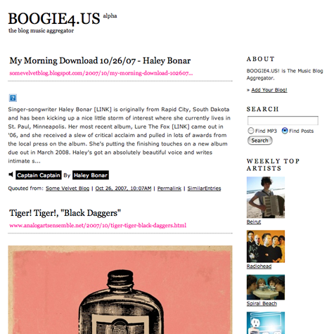
 I recently stumbled across Boogie4.us, a music blog aggregator similar to The Hype Machine and Elbo.ws. Like most blog aggregators, the service basically tracks a variety of music blogs into a single location for easy access.
 The River of Music
The sites home page lists posts from all of the tracked blogs essentially providing a “river of music”. In addition to a brief snippet of the blog post, each entry also contains mp3 which can be played directly within the page. The sidebar also contains a search box and links to weekly top artists, recommended blogs, top blogs and recently updated blogs.
Artist Pages
When you click on any artist name, you are taken to an artist results page which shows all blog posts that contain a reference to the selected artist. These pages also display artist bios (via Wikipedia), a link to their official site, related genres, music videos (via YouTube), discography (via Amazon), similar artists, and links to all blogs that discuss the artist. Like most sites that use web services from other sites, the information is often incomplete or just plain wrong (for instance, Of Montreal’s bio uses an entry for Bank of Montreal)
One of the nicest features is the mixtape player which takes all mp3 from the artist across all blogs and puts them into a single streaming playlist. There is even a link to the original blog post that contains the mp3.
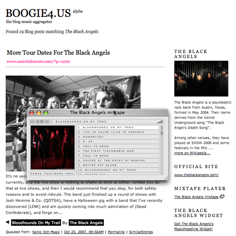
Another cool feature is the artist widget which lets you embed all blog posts associated with an artist directly into your web site, social network profile or blog.
Blog Pages
Clicking an individual blog link takes you to a page that contains all entries from that blog. In addition to the blog description and official link, the page provides stats such as number of entries, number of mp3s and number of videos. There is also a list of all artists that are mentioned in the blog’s posts though unfortunately they are not sorted alphabetically which makes it difficult to scan, especially with blogs that cover lots of artists.

While the service, currently in alpha, does not have the same level of features as the new Hype Machine, it is still an impressive effort. However, when it comes to blog aggregators, I think the new Hype Machine provides a much better overall experience - especially with their tracking features which make it much more useful tool than Boogie4.us.


 Del.icio.us
 Last.fm
 Strands
 Virb
Virb YouTube

