


 Del.icio.us
 JamsBio
 Last.fm
 Musebin
 Pownce
 Rhapsody
 Signal Patterns
 Strands
 StumbleUpon
 Virb
Virb YouTube
Entries in Statistics (5)
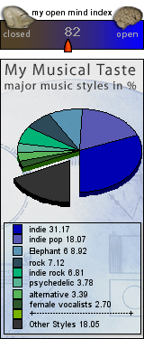
Last.fm Visualization: What's Your Open Mind Index?
After you type in your last.fm username, you are provided with your own musical taste widgets which can be embedded in your last.fm profile. The site also provides consolidated data for about 80,000 last.fm users and reveals some interesting information (e.g. Vatican City has the highest OMI at 106.9). Here is my OMI calculation:
Fairtilizer: Community-Driven Charting
![]() I finally got a chance to check out
I finally got a chance to check out
Members have the ability to post content to a buffer area where Fairtilizer determines if the track does not infringe on copyright and passes their editorial standards. Junior and Senior members, which I assume are verified artists and labels, have the ability to circumvent the buffer zone. While the distinctions between membership tiers is undocumented and taxonomically confusing, this approach is a good way to ensure legality and content quality.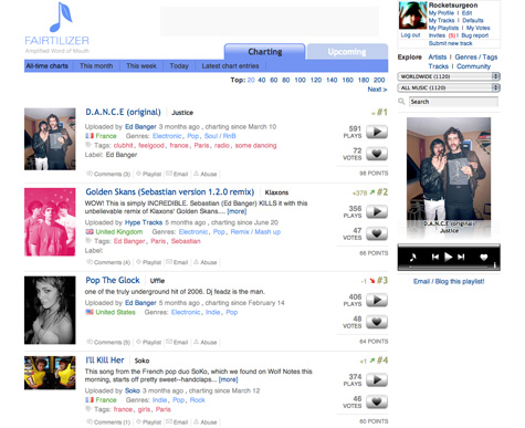
The home page presents a list of all-time chart toppers that include descriptions, country of origin, genres, tags, rank, number of plays, and number of votes. You can also access charts for the month, week and day. You can also filter tracks by tag, country of origin, and genre - so for instance I can see all girl-based pop tracks from France (btw there are 2 to date). The filter controls could use a bit of redesigning as they seem to be scattered throughout the page and the # of tracks displayed in the pull down menus for country and genre don’t update as you add filters. Tracks are played in a flash-based player on the right of the screen. Unfortunately when you navigate to another page, the playback stops. You can pop-up the tuner in a different window but it doesn’t work when you click play on a different track. The service allows you to comment on individual tracks and add them to a playlist. Playlists are easily managed and can be embedded in webpages and blogs.
Despite the many UI issues, the community-driven charting model does indeed result in some really great music discovery. In the short time I have used the service, i have found a variety of songs and bands I really like and would likely not have found. Fairtilizer is only available by invite at this time but you can request one at their site.
Stats Galore! Internet iTunes Registry
 The Internet iTunes Registry is a project that allows you to upload your iTunes library file to a central database and get detailed reports on the listening behavior of yourself and the entire community. iTunes provides minimal information on your listening behavior and Last.fm, while much better, is more focused on providing recommendations and community tools.
After completing the free registration, I uploaded my library.xml file. I was pleasantly surprised to see all the available features and tools to help me analyze my behavior including:
- Artist, album and track statistics
- Histogram style listening habits
- Stats about your ratings
- Detailed genre and subgenre stats
- Tons and tons of useful and useless charts
- An interesting set of odd facts about your behavior
- A wallpaper generator
The one thing that bothers me most about the project deals with genre mapping. iTunes lets you assign custom genres, which can cause problems when calculating community statistics. To simplify the charts, IIR asks you to map all of your genres to their predetermined set. Unfortunately, this set only contains a few basic genres and some strange ones - for instance there is a rockabilly genre but no R&B. I understand the need for genre mapping, but IIR should use the default list that is used in iTunes.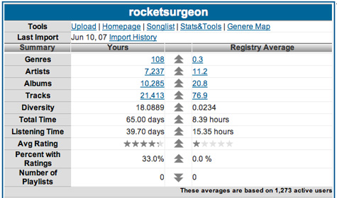
 There were a few performance problems here and there, the UI could really use some polish and I could not get some of the tools to work properly. However, It is definitely worth checking out if you’re like me and always wanted to know how many hours you have actually used iTunes since installing it and what your least recently played song was. You can check out my page here.
 Jadam Kahn
in Community, Data Mining, Statistics, Tools, Visualization, iTunes
|
Jadam Kahn
in Community, Data Mining, Statistics, Tools, Visualization, iTunes
|
 2 Comments
LastGraph Update: Last.fm Visualizer
![]() Last week I covered a variety of Last.fm visualizations. One of the most promising of the bunch is an online utility called LastGraph. When I first tried to use the service it was offline. Now its back up, working great and sporting some cool new features. Basically, LastGraph takes your Last.fm listening behavior within a certain date range and creates a really beautiful wave graph of it. The updated version now lets you select from a variety of color schemes in addition to the classic Ocean theme. I did have problems opening the generated PDFs in Preview but when i rasterized them via Photoshop, they showed up no problem. There is also a Flickr group to upload your own graphs. Have a friend on Last.fm? For their next birthday, use this tool to generate a giant poster of their listening behavior.
Last week I covered a variety of Last.fm visualizations. One of the most promising of the bunch is an online utility called LastGraph. When I first tried to use the service it was offline. Now its back up, working great and sporting some cool new features. Basically, LastGraph takes your Last.fm listening behavior within a certain date range and creates a really beautiful wave graph of it. The updated version now lets you select from a variety of color schemes in addition to the classic Ocean theme. I did have problems opening the generated PDFs in Preview but when i rasterized them via Photoshop, they showed up no problem. There is also a Flickr group to upload your own graphs. Have a friend on Last.fm? For their next birthday, use this tool to generate a giant poster of their listening behavior.

Last FM Visualizations
![]() Initially, i really appreciated the way Last.FM would chart my listening behavior. It provided new insights into my music consumption that were unavailable in iTunes. Over time, they became less interesting. The trapped-in-time snapshots fail to provide me with any additional insight into my behavior. So I decided to take a look at some tools that use your Last.fm data to make it more personal and insightful.
Initially, i really appreciated the way Last.FM would chart my listening behavior. It provided new insights into my music consumption that were unavailable in iTunes. Over time, they became less interesting. The trapped-in-time snapshots fail to provide me with any additional insight into my behavior. So I decided to take a look at some tools that use your Last.fm data to make it more personal and insightful.
Lee Byron
There has been a ton of buzz regarding Lee Byron’s beautiful histograms of Last Fm data. His inclusion of the time element has the power to elicit a strong personal connection to your listening history. As you explore the histogram, you can see how preferences change over time an how one could map that data to personal events. Unfortunately, Mr. Byron does not provide a means to generate your own histogram.
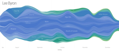
Chart Stream
Inspired by Byron’s work, this is a tool that provides a simple visualization listening habits over time, derived from weekly Last.fm artist charts. Chart Stream does not allow you to view your own data though has a number of nice examples.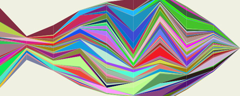
LastGraph
More promising is LastGraph, which looks like it will generate a Byron-esque histogram based on your Last.fm profile. However, when I went to use the tool, there were no rendering nodes currently online. I’ll need to check back after the holiday is over.
Your Last.fm in Time
Another tool for visualizing behavior over time. Unlike the others, it graphs artists based on total cumulative playcounts. Though not as useful or immersive as a histogram, it does provide some interesting insights into behavior.

Chart Changes
This is a very cool Greasemonkey script that inserts chart position changes directly into your Last.Fm charts.

Score500
Displays historical data from the overall charts as charts and diagrams. And it calculates and displays the chart changes over a period of time. You need to request an account to see your own data.
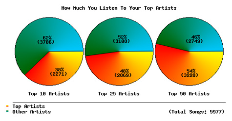
How Do You Listen to Music?
This a a very interesting tool that provides some very insightful behavioral statistics and charts.
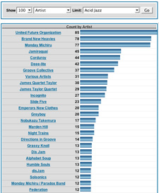
Extended Last.fm Stats
Just type in your Last.fm username and a date range and this tool will return tons of interesting artist stats such as playcounts, weeks in charts, and chart positions.
Mainstream-O-Meter
The Mainstream-O-Meter calculates your mainstreamness by comparing the listener count of your favorite bands to the average listener count of the five bands who have the most listeners among Last.fm-users.

Musical Taste Meter
The script lists the users top 20 overall artists and lists the 8 most similar artists to each one, then delete’s any repeated artists. The idea is to see how varied your taste is, a score of 9 is extremely unvaried while 160 represents an extremely varied one.
AEP Calculator
AEP is a measure of how diverse your music tastes are, based on the top 50 artists in your Last.fm profile.
Eclectic Score
A script that computes your eclectic score based on the 20 top artists in your musical profile from Last.fm.
Similarity-O-Meter
Compare two Last.fm users, based on their personal musical tag clouds. This approach is different from the approach used by Last.fm, where users in the population are compared based on the common artists in their playlist.
Personal Tag Cloud
Generates a genre-based tag cloud based on your top artists within a specific time frame. there is also a tool to generate a cloud of recommended artists.
Jadam Kahn
in Data Mining, Statistics, Tools, Visualization
|
10 Comments
|
 1 Reference

Copyright © 2005, Rocketsurgeon. All rights reserved.