


 Del.icio.us
 JamsBio
 Last.fm
 Musebin
 Pownce
 Rhapsody
 Signal Patterns
 Strands
 StumbleUpon
 Virb
Virb YouTube
Entries in Design (4)
The Logos of Music 2.0 - Twitter Style
The Favicons of Music 2.0
I did a previous entry about the Logos of Music 2.0 and thought a good followup should focus on favicons. Favicons are interesting because they need to be recognizable, distinct, and convey a brand image despite their limited size (16×16). They show up in the browser address bar, on browser tabs, and even in RSS feeds. Here is a collection of favicons from the Music 2.0 directory documented on this site. Many of the sites listed there did not have an associated favcicon, hence the smaller number of entries here than the logo collage. For a complete listing of companies check out the Music 2.0 Directory


 1 Reference
Pandora's Sexified Redesign
![]() Pandora just launched the redesign of their web site. Aside from some slick Web 2.0 style design (round corners, gradients, faded patterns, etc.) the site features fully integrated advertising. Not a bad idea given the potential for impending rate hikes for streaming radio. Now I’m not a huge fan of advertising on the web, but Pandora’s implementation is pretty interesting and effective. Ads on most sites look like they are just slapped into a space on the page with little relation to the overall page and many users simply ignore standard skyscraper or square ads due to “banner blindness”. Pandora’s integrated approach makes the advertising and page seem like a cohesive whole.
Pandora just launched the redesign of their web site. Aside from some slick Web 2.0 style design (round corners, gradients, faded patterns, etc.) the site features fully integrated advertising. Not a bad idea given the potential for impending rate hikes for streaming radio. Now I’m not a huge fan of advertising on the web, but Pandora’s implementation is pretty interesting and effective. Ads on most sites look like they are just slapped into a space on the page with little relation to the overall page and many users simply ignore standard skyscraper or square ads due to “banner blindness”. Pandora’s integrated approach makes the advertising and page seem like a cohesive whole.
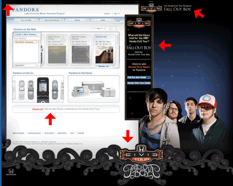
The ad integration includes (not in all cases) a short message in the upper left, branding in the upper right, a skyscraper ad on the right, a background image towards the bottom and right and a text ad directly beneath the main content area. Many advertisers also have a branded Pandora station as well. As you progress though songs, the ads reload and cycle on the page.
 Jadam Kahn
in Design, Personaliztion, Radio, Recommendations, Streaming
|
Jadam Kahn
in Design, Personaliztion, Radio, Recommendations, Streaming
|
 Post Comment
The Logos of Music 2.0
Identity deisgn is perhaps one of the most challenging projects for any designer. Not only do you need to clearly express the concept and personality of the brand, but also differentiate yourself from the competition. This was the challenge I faced when designing the original Music Now logo a few years ago. Well since that time, the number of competitors in the digital music space has grown exponentially. Inspired by Stabilo Boss’ now famous Logos of Web 2.0 montage, I did some research and collected logos from the Music 2.0 space.

There are lots of similar design trends with the overall Web 2.0 space - rounded fonts, wet floor effects, gradients, bright colors, etc. More specific to Music 2.0, there’s a predominance of grungy design usually associated with alternative and punk music. Red and blue logos seem to be the dominant color choice, followed by green and orange.
Keep looking to this blog as I detail more design patterns in the Music 2.0 space.

Copyright © 2005, Rocketsurgeon. All rights reserved.