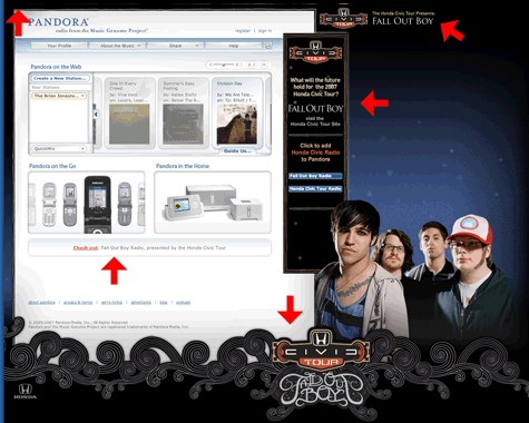
 Pandora just launched the redesign of their web site. Aside from some slick Web 2.0 style design (round corners, gradients, faded patterns, etc.) the site features fully integrated advertising. Not a bad idea given the potential for impending rate hikes for streaming radio. Now I’m not a huge fan of advertising on the web, but Pandora’s implementation is pretty interesting and effective. Ads on most sites look like they are just slapped into a space on the page with little relation to the overall page and many users simply ignore standard skyscraper or square ads due to “banner blindness”. Pandora’s integrated approach makes the advertising and page seem like a cohesive whole.

The ad integration includes (not in all cases) a short message in the upper left, branding in the upper right, a skyscraper ad on the right, a background image towards the bottom and right and a text ad directly beneath the main content area. Many advertisers also have a branded Pandora station as well. As you progress though songs, the ads reload and cycle on the page.